We like to talk about a lot of things here at INETCO. But just last week, when I asked a customer what they thought about our INETCO Insight mobile application, I realized from the blank stare I got back in response, that maybe we have not given this the spotlight it deserves…so here it goes!
I am very excited about the INETCO Insight 5 platform because for the first time we released an INETCO Insight mobile web application! The app allows INETCO Insight customers to view INETCO Insight alerts through their mobile device. When an INETCO Insight alert is received by email, it now contains a link to get more details for that alert. Clicking on that link from any device will bring up the alert details including what caused the alert, when the alert occurred and what is the priority of the alert. Besides this, all of the transaction details are also available – any details needed to understand what has caused the alert can be accessed anytime and anywhere you have access to the Internet.
When designing the application, we were concerned with 2 major challenges: The first, how are we going to display all the transaction details and alert details that users need, and secondly, how to ensure that the data is displayed very quickly on mobile devices. We overcame the first challenge by getting a lot of feedback on the designs and applying ideas that worked well in the INETCO Insight application, but still ensured all the information was easily readable and clickable on any mobile device. For the second challenge of displaying the data within a reasonable timeframe, we updated the web server and client architecture to only send information that needed to be displayed on the screen at any given time so the data could be displayed promptly after the user requested it. Let’s discuss the main features of viewing alert details:
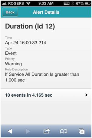
When an alert is received by email, a link is included. Selecting the link will open the alert details, which include the alert name, time, description and priority of the alert. As shown in the screenshot below, this gives a quick overview of the important alert information.

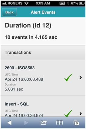
Selecting the events information at the bottom of the screen displays the events that triggered the alert. We wanted to give enough information so the problem that caused the alert would become visible without cluttering or overloading the screen. If the event was caused by a transaction, whether the transaction failed or was successful is displayed with a checkmark for success or red x for failure. Timing information is also displayed for each transaction or statistic. You can see this in the following screenshot…

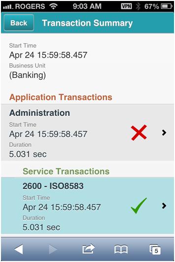
If further information is needed about the transactions, selecting a transaction will bring up a screen with the transaction details. Here the transaction summary is organized from the business, application, service and finally the link layer. Again, transaction timing information and checkmarks and x’s are used to highlight success or failure of a particular part of the transaction. The screenshot below shows how the transaction information is shown below….

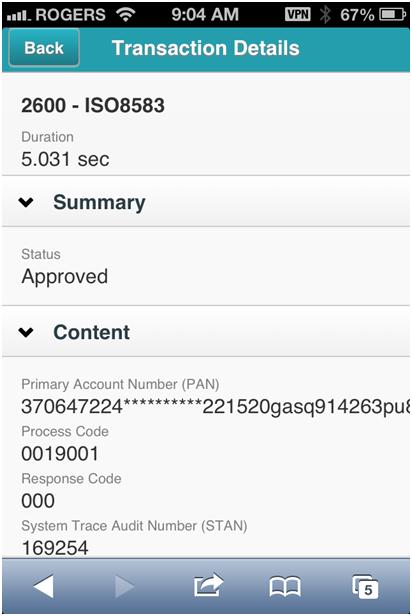
Finally, if needed, selecting a particular transaction will display all the details (i.e. fields) available for that transaction. The transaction fields are organized into sections, which can be expanded or collapsed to save room on the screen and make it easier to find the particular info that is required. This is shown below…

Over the next few months, we are continuing to work on the INETCO Insight mobile application. We would love to hear your thoughts on how we can improve this application. Please feel free to ">contact us, share your feedback on this blog, or arrange for and INETCO Insight demonstration.

 English
 French
 Portuguese
 Spanish