 In Part 1, and Part 2 of this series, we dove into the first thing you needed to do customer analytics well: getting ready access to a complete source of customer interaction data. Part 3 discussed the second major requirement: gaining access to a range of complementary data like demographics, BIN lists, ATM descriptions, etc.
In today’s blog we’ll dive into the final major requirement for ATM customer analytics: navigating and visualizing the data.
There are two primary use cases for navigating and visualizing data:
- Exploring the data to find interesting patterns and answer common questions.
- Presenting your findings to senior management and other stakeholders.
The first use case is typically the province of the data analyst or the ATM channel manager. You are typically starting with a premise or hypothesis and then looking to the data to help you confirm or refute your assumptions.
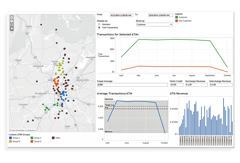
A good customer analytics solution should present an easy-to-understand data model. For example, INETCO Analytics has a rich data model that includes ATM locations, types, estimates of queue length at ATMs, cash positions by time of day, failures grouped by error type, and records of all the transactions a customer executes during their session in front of the ATM, and payment fraud analytics. This allows a user to easily slice and dice an estate and then analyze performance across a variety of dimensions.
The second element of satisfying the data exploration use case is providing an intuitive interface for exploring the data. Here, we chose Tableau as a front-end tool, which provides a graphical environment for easily analyzing the data models provided by INETCO Analytics. For most Excel power users, Tableau is an easy environment to master, and INETCO Analytics provides a wide variety of pre-built dashboards to get you started.
Once you’ve uncovered the interesting patterns and insights, you want to present them to your colleagues, so you can take action. This gets into our second use case.
Historically, you’ve probably cobbled information from a range of scheduled reports and 3rd party sources, wrangled the data into Excel, and then tried to produce charts you can embed in PowerPoint. This is typically a labor-intensive process that is very sensitive to any change in your operating environment (someone moved the ATM ID column two to the right – argh!).
With INETCO Analytics, this entire process is automated and bulletproof. You can directly present the rich dashboards included in the product (or show your own) and interact with the data on-the-fly to answer questions as they come up.
We started this blog series with the assertion that most banks lack the means to easily and systematically analyze customer behavior. As your customers interact over a broader variety of channels and use more self-service technologies, it’s critical that you adopt a pragmatic plan for customer analytics.
We laid out a four-point customer analytics plan that starts here for how you turn customer analytics into an automated process performed by software (like financial analysis or product analysis), instead of a labor-intensive, time-consuming manual process conducted by channel managers and marketing executives.
To learn more about customer analytics with INETCO Analytics, request a demo.


 English
 French
 Portuguese
 Spanish