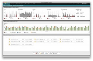
 As the designer of INETCO Insight’s Application Performance Monitoring (APM) User Interface, I have always been particularly passionate about how to visualize the large amounts of data we are collecting and correlating to allow people to monitor, analyze and troubleshoot problems faster.
A couple of years ago, I attended the Computer Measurement Group (CMG) conference in Washington, DC and connected with a lot of great people. I was pleasantly surprised to see a lot of the attendees shared my passion for creating useful visualizations and was also looking for the best way to display their data so it could be easy to explore, understand and share. Scott Chapman from American Electric Power was particularly interested in topic and had a lot of great ideas so while sharing a conventional beverage, we decided to write a paper together and submit if for the CMG 2012 conference.
Even though Scott and I lived across time zones and in different countries (Scott is from Columbus, Ohio and I am in Vancouver, BC) we were able to collaborate and write a paper about best practices and guidelines for creating visualizations. We were happy to see our paper, “Better Information from Better Data Visualization”, got accepted and even happier to learn that it also won the Best Paper award.
Here’s a summary of the whitepaper:
As performance analysis and capacity planners, we collect data to share with co-workers and management in order to explain and justify our technical capacity and performance recommendations. To display this data, we often create the easiest graphs and don’t consider how it is perceived. This paper discusses ways to visualize data and describes scenarios in which these visualizations should be used to transform data into useful information. We discuss common ‘mistakes’ and ways to improve your charts to better get your point across and better represent your intended message.
As well as winning the Best Paper award, I was awarded the J. William Mullen Award for our presentation! The Mullen Award includes a stipend that will enable me to present this paper to a number of regional groups in North America, EUROTEC in the UK, and International chapters around the world. I am honored and excited that I get to share our paper and our work with others and look forward to spreading the word about how to create good visualizations.
I would also like to share this paper“Better Information from Better Data Visualization”,“Better Information from Better Data Visualization”, with any of you that are interested in data visualization, and would love to hear of any major challenges you may be having when it comes to exploring, understanding and sharing your data.
